Creating a Font with TypeTool
Two weeks ago I released my newest font Honey Pigeon, and although it's quite some work to get a font designed and kerned, it's also a lot of fun to do so. That's the reason why I want to share a quick glimpse into font design in the hope to get you interested into that wonderful hobby.
Tools
My tool of choice for font design is TypeTool 3, the little brother of FontLab. While it's rather limited in features, it is with a price tag of about $50 quite inexpensive, at least in contrast to FontLab, which costs an overwhelming $500.
Glyphs, glyphs, glyphs
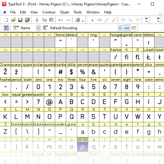
That's the glyph window in TypeTool. I chose to focus on the Latin 1 character set, as it covers most European languages. I would like to add Cyrillic and other scripts into my fonts at one point in the future, but it's quite some work to keep the style and quality consistent across hundreds of glyphs. Don't get me started on kanjis and other Asian character sets, which is simply impossible to realize for a one-man-show.
Designing Glyphs
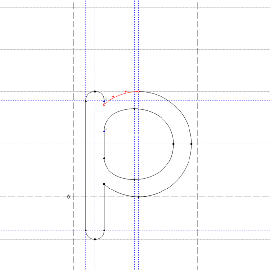
Here's the view on the "p" glyph from Honey Pigeon. Glyphs are vector-based and defined by points and curves. The blue lines are helper lines to align the points properly, The dashed horizontal is the baseline on which most of the characters reside, but some like the "p" go below and even reach the so-called descender, the dotted horizontal line at the bottom. The height of a small character is called the x-height (as it is usually the height of a small "x"). The other two horizontal lines are called the caps height (the height an uppercase letter reaches) and the ascender, which is the maximal height, including accents.
After reading through books (I can recommend Thinking with Type) and articles I quickly realized that there's an immense knowledge and science behind both the design of a typeface and its implementation as a font. Sometimes it is rather overwhelming. Look, for example, at the image above and how the bars of the "o" part of the letter get narrower towards the stem; without that, the "p" will look too thick around the stem. There are dozens and dozens of little tricks like that. Font design is an endless battle against the human eye and the psychology behind it.
Kerning
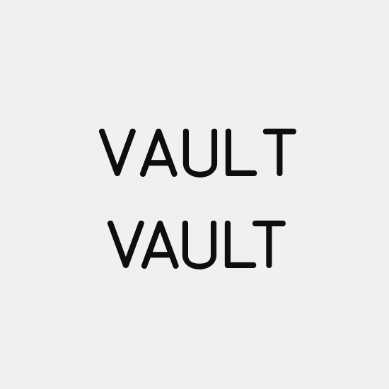
Which brings us to the next issue with the human eye: kerning. Half of the time I have spent on this font went into it. Kerning is the positional adjustment of specific character pairs to avoid negative spaces disrupting the visual flow of a word. The example above shows the word "VAULT", first without and then secondly with kerning. The spaces between "V" and "A" as well as "L" and "T" look disruptive and had to be reduced in size. With 26 lowercase and 26 uppercase letters as well as special characters, you can see where this is going. Normally, one tries to keep the amount of kerning pairs down to avoid bad performance caused by a huge font file, but personally I think that I rather have a pleasant font than a performant one.
There is a kerning game which you should check out, as it is rather entertaining!
To help a bit with kerning, professional design software like FontLab make use of kerning classes. Take the characters "Q" and "O" for example, which may have, depending on the font, the same left side and therefore could apply the same left-sided kerning. Sadly, TypeTool doesn't support kerning classes, but luckily it allows to export and import kerning metrics, hence with a little programming power, I've created a console application which applies the kerning of classes I defined by myself within a script file.
Conclusion
I hope you enjoyed this little behind-the-scenes and maybe you even got interested in trying it out yourself. While font design sounds like a lot of work, it's nevertheless engaging to bend lines and shapes into a visually pleasing letter! :-)
Comments
Log in with itch.io to leave a comment.
thanks for the small insight into the dev process!
Interesting! Did you have to get into pixel-hinting too, or is it automatic these days?
You can do some basic vertical and horizontal hinting with TypeTool for the vertical/horizontal stems/bars, but even that can be automated. More complex hinting isn't possible though.